by Smrithi Ramesh

GRAPHIC DESIGN

Port
Folio

20
26

S ✦

Branding · Packaging · UI UX · Social Media · Art

scroll for the good stuff ↓
Smrithi Ramesh

Contact ✦

Technical Skills ✦

Ps Ai Id Pr Fg

Interests ✦

Packaging design Traditional art Illustration Typography Music

About Me ✦

I am Smrithi, a graphic designer with a love for branding, packaging and design that tells a story. My path started long before design software, with graphite and oil paint, and that traditional art foundation still shapes how I see colour, light and the small details people feel before they notice.

Today I create brand identities, packaging, social media creatives and print work that help businesses stand out and genuinely connect with their audience. If you are looking for a passionate designer to bring your ideas to life, let's talk.

Education ✦

2020 to 2024

Bachelor of Design, Graphic Design

World University of Design

Experience ✦

2026 to present

Graphic Designer · Adrageous Media

Meta ad creatives, branding and print production for a creative marketing agency in Brighton.

2024 to 2025

Graphic and Print Designer · Nayims Embroideries

Head of print production, creating logos and managing print for brands including Foot Locker and New Era.

2024

Graphic Design Intern · The Roadelabs

Branding, UI UX, identity, social media and advertising.

Portfolio · Branding

Cheesy Buns

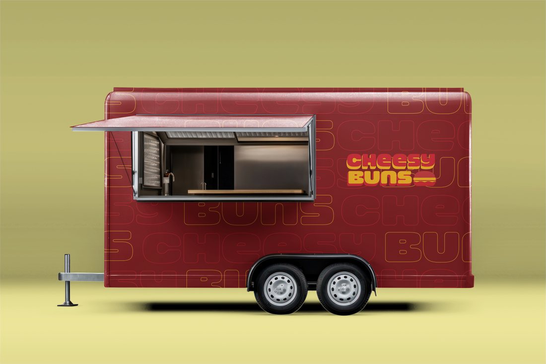
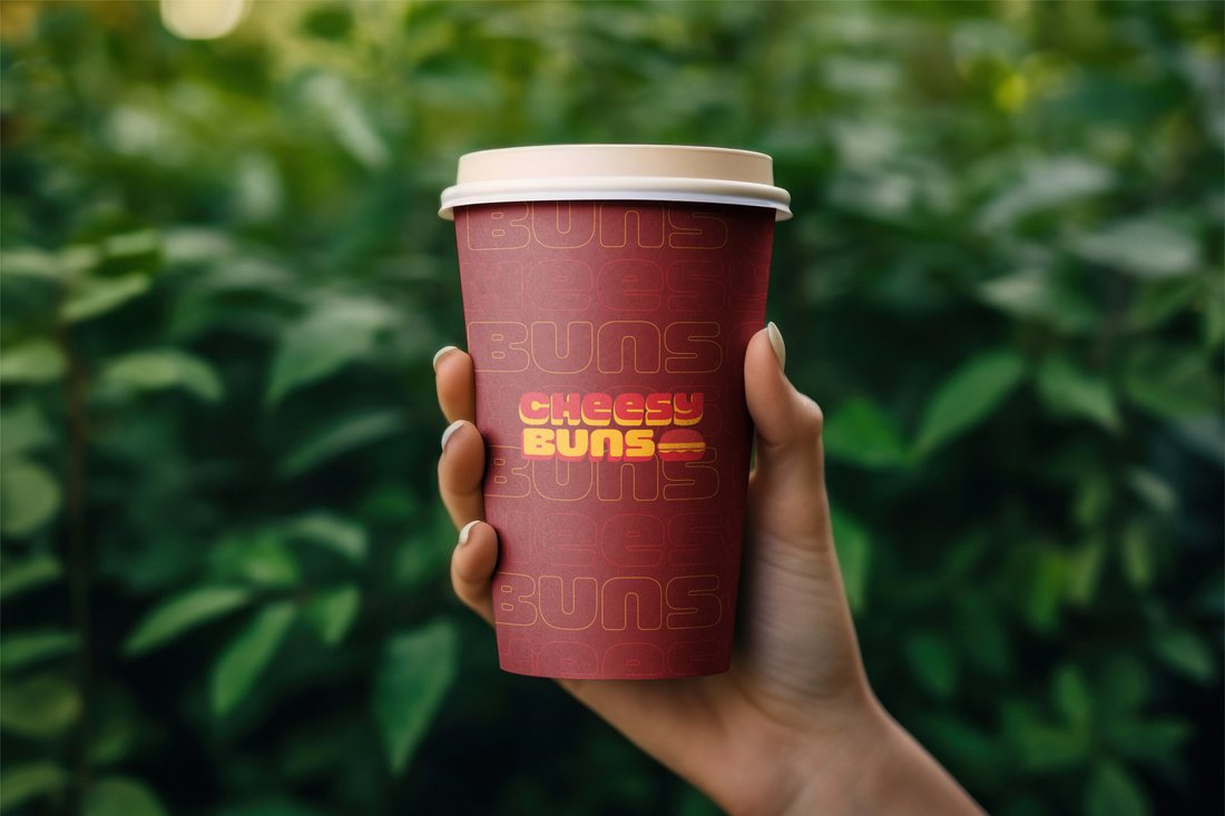
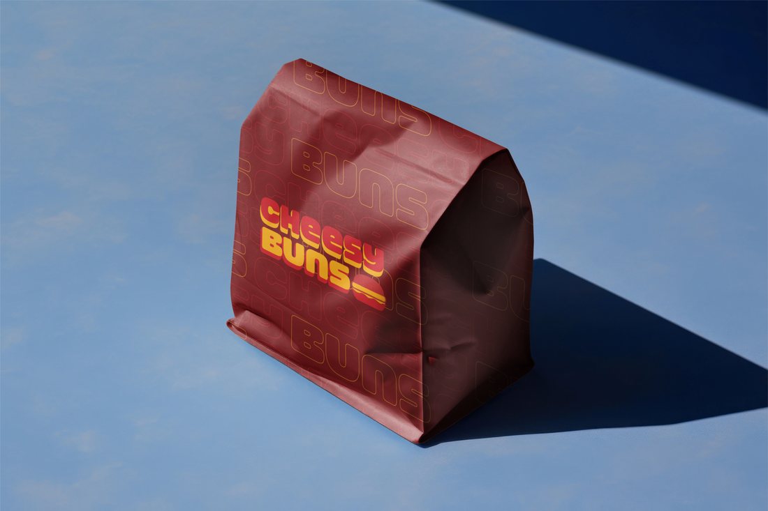
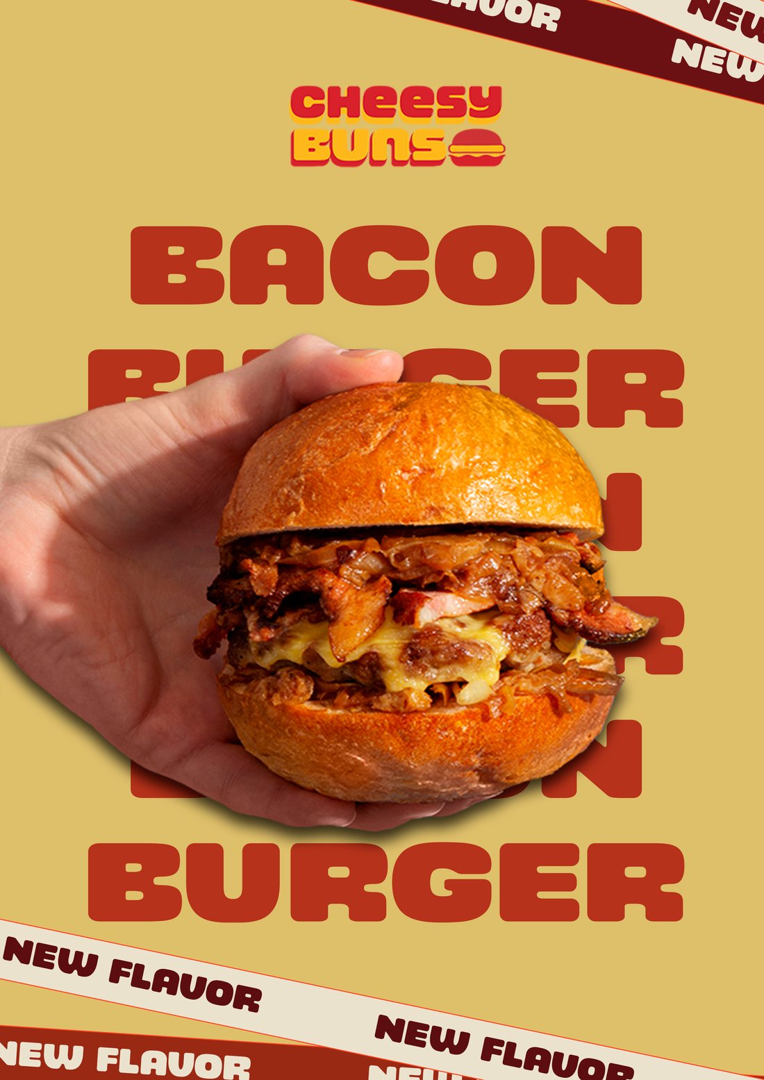
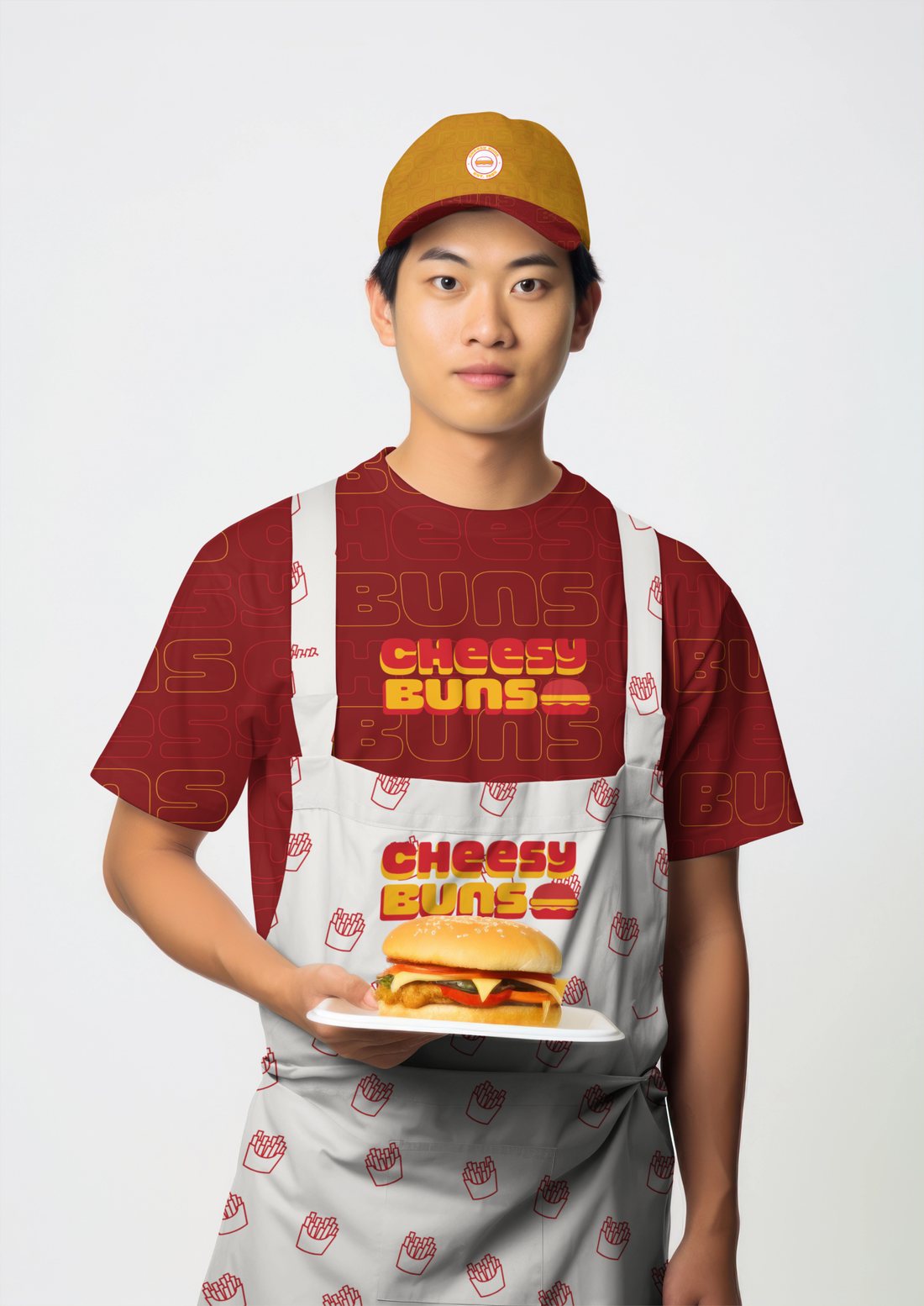
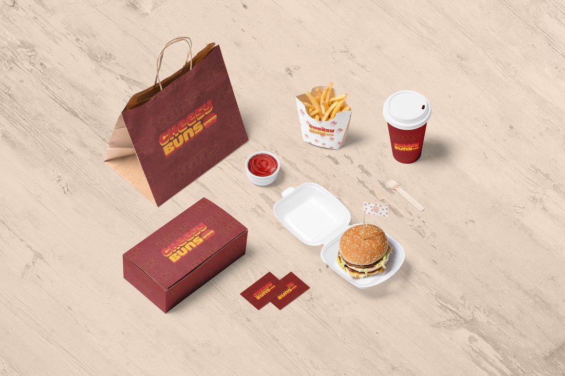
Cheesy Buns is a gourmet burger restaurant and food truck built around one promise: the ultimate cheesy indulgence. I created the full brand identity, from the retro logo and colour palette to packaging, staff uniforms and the food truck livery, all designed to feel warm, playful and impossible to miss.

Date: 2024

Colour Palette ✦

The brief ✦

Take a gourmet burger restaurant and food truck from nothing to a full brand: the name, the logo, and everything a launch would need.

The challenge ✦

Street food is loud and crowded. The brand had to feel premium enough for a sit down restaurant but playful enough to stop someone walking past a truck window.

My role ✦

All mine, from the first moodboards to the final artwork on every single touchpoint.

Creative direction ✦

I leaned into retro diner nostalgia with warm reds and mustard yellow that make you hungry just looking at them. Familiar, indulgent and impossible to miss.

Across channels ✦

One identity doing everything: packaging, staff uniforms, the truck itself, posters, stickers and social promos.

The outcome ✦

A complete launch ready brand kit that works just as hard on a burger box in someone's hands as it does on the side of the truck.
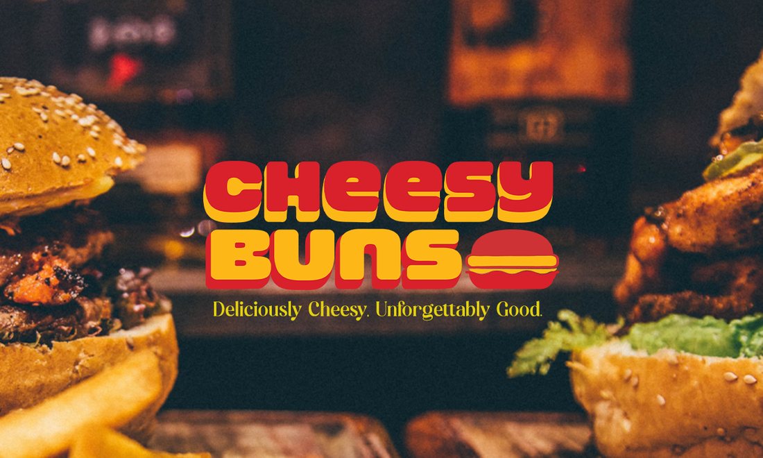
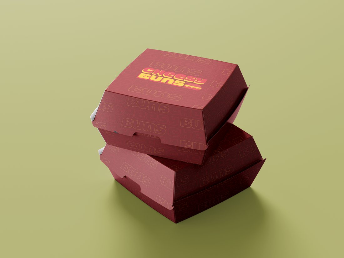
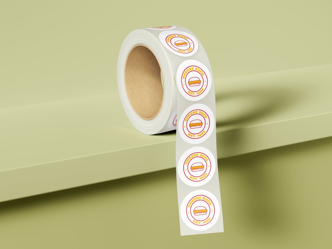
Cheesy Buns logo over burger photography Cheesy Buns burger boxes stacked Cheesy Buns food truck Cheesy Buns branded cup held up outdoors Cheesy Buns paper pouch packaging Cheesy Buns bacon burger new flavour poster Cheesy Buns staff uniform with cap and apron Cheesy Buns sticker roll Cheesy Buns full packaging range flat lay

Portfolio · Branding

FLAIR

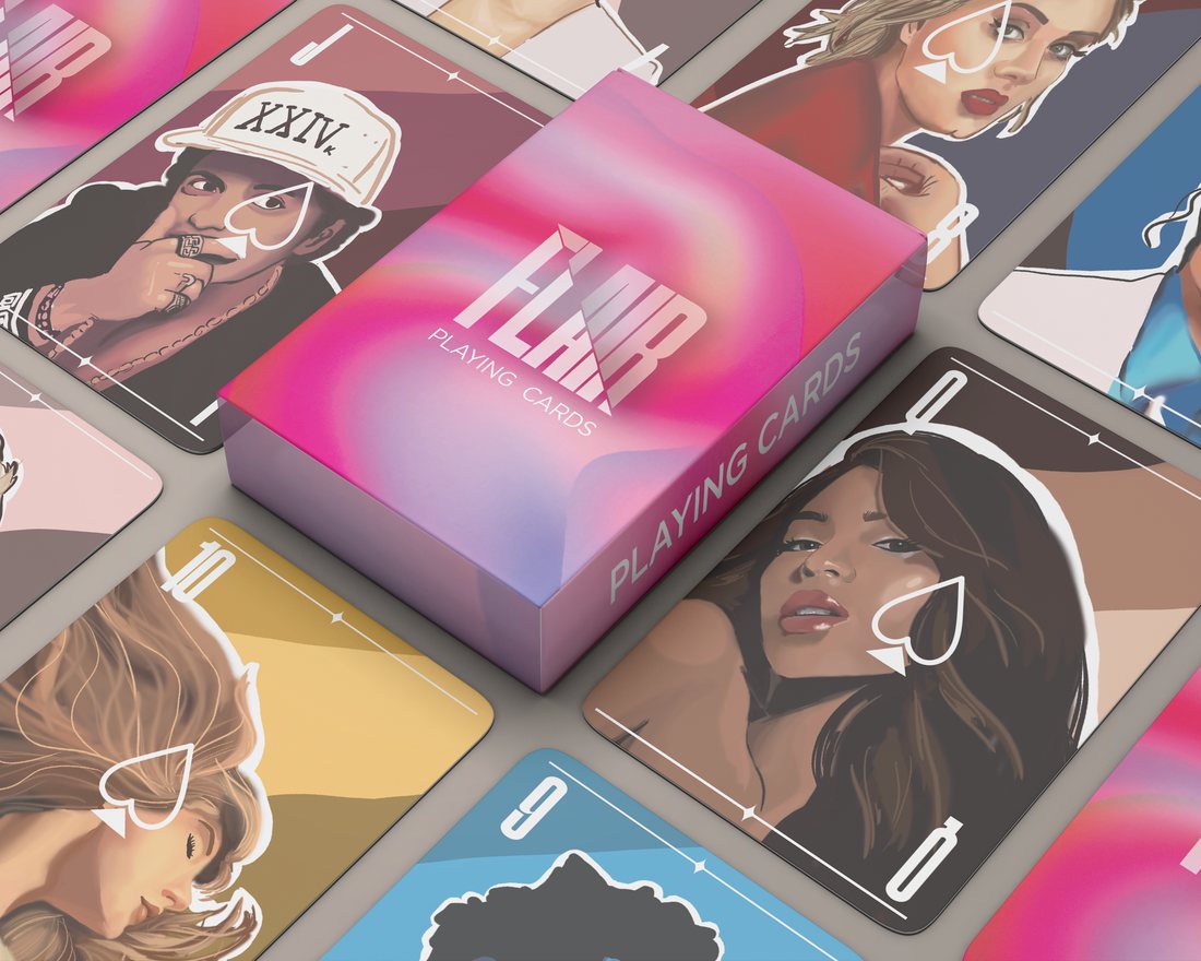
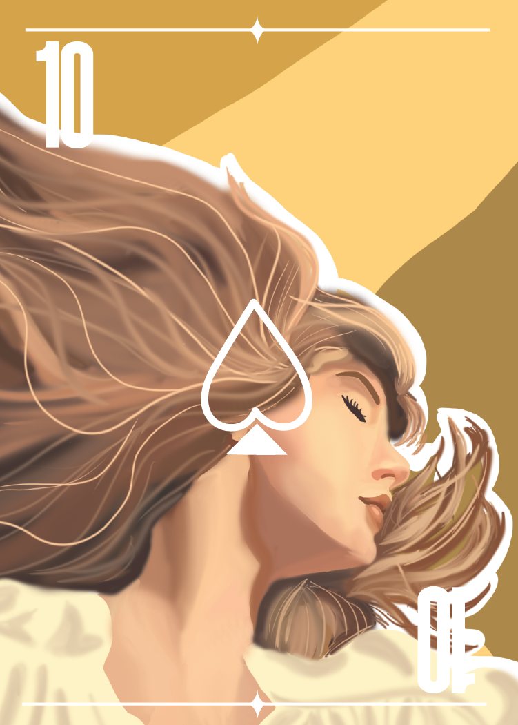
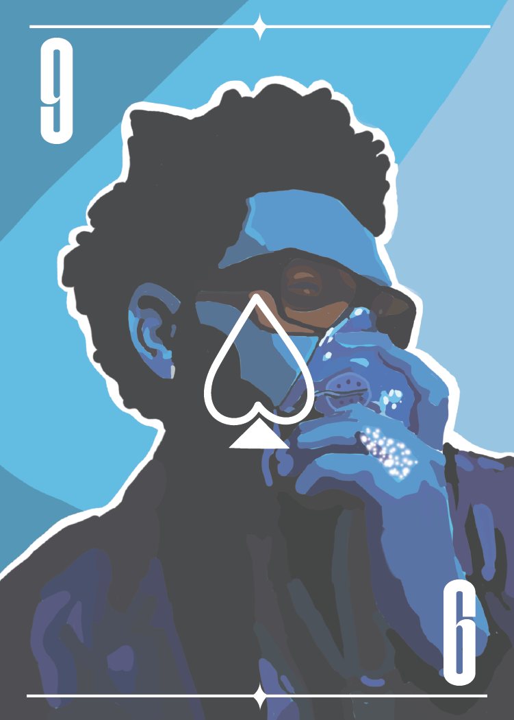
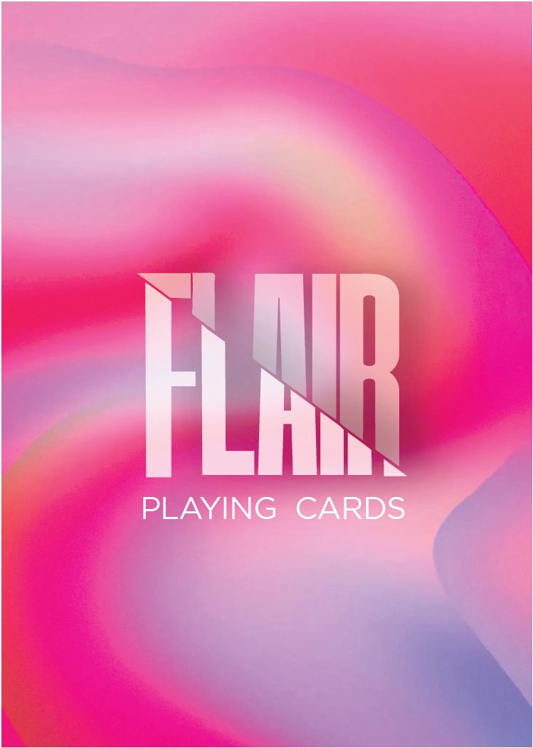
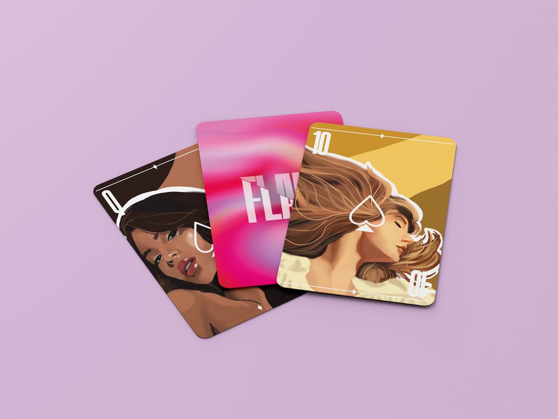
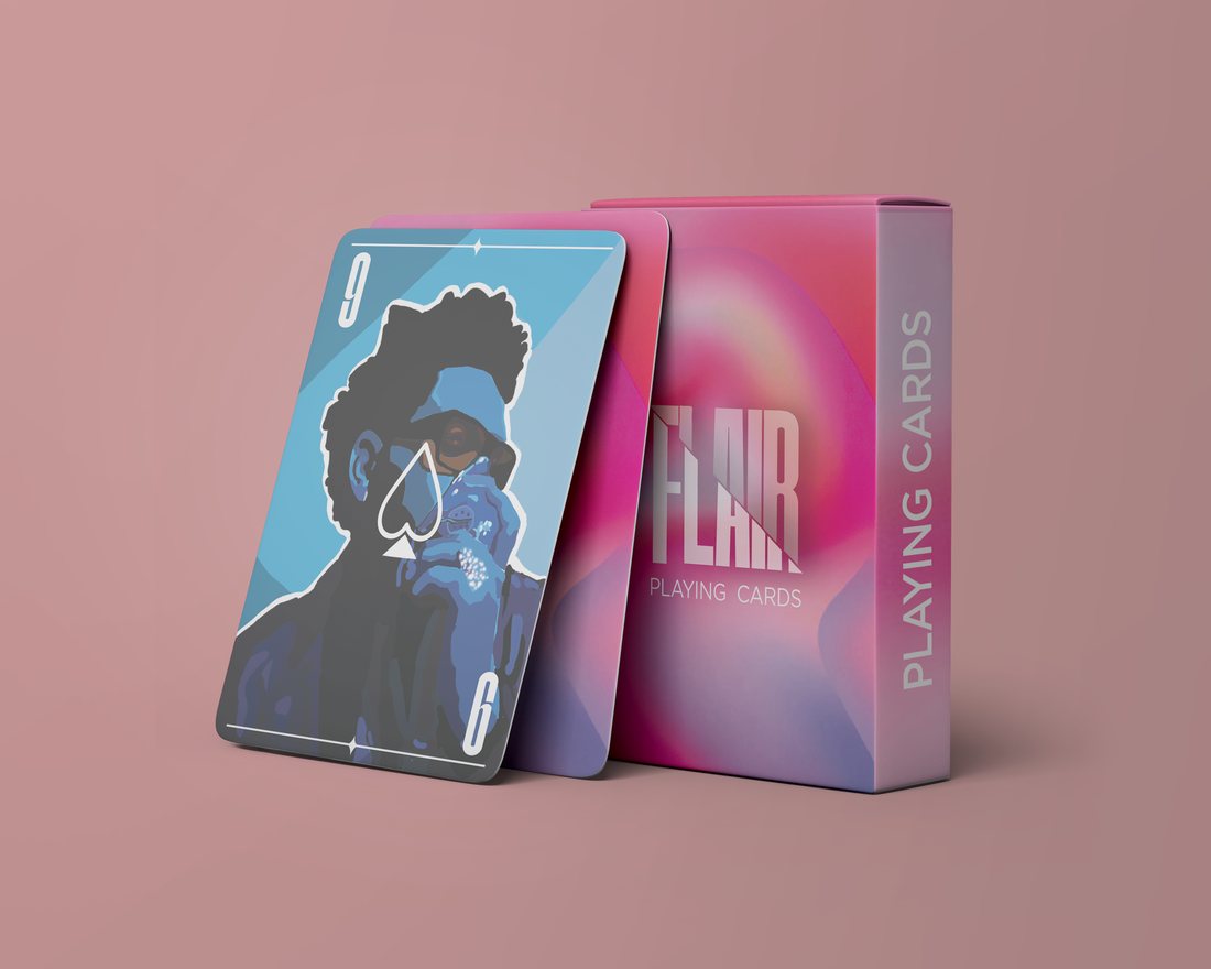
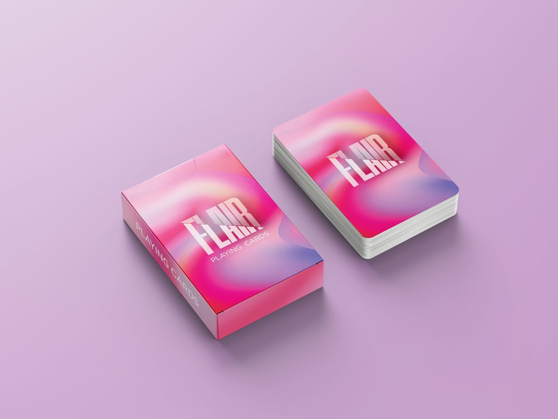
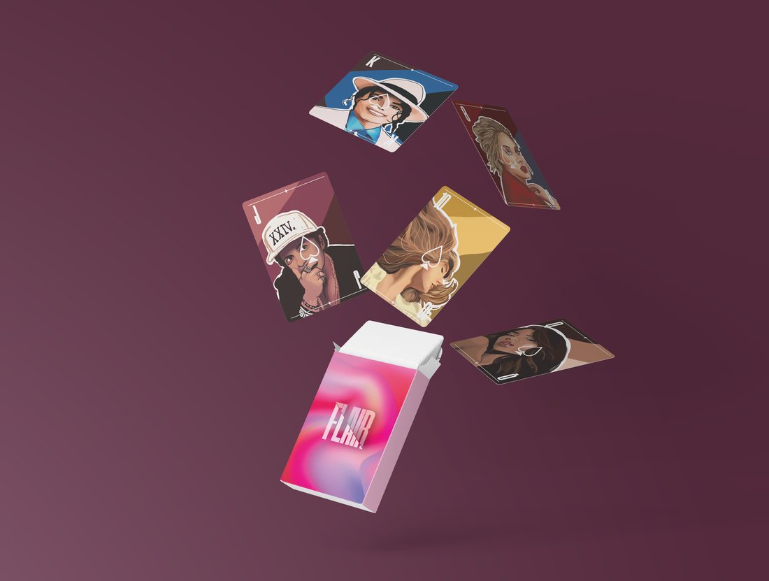
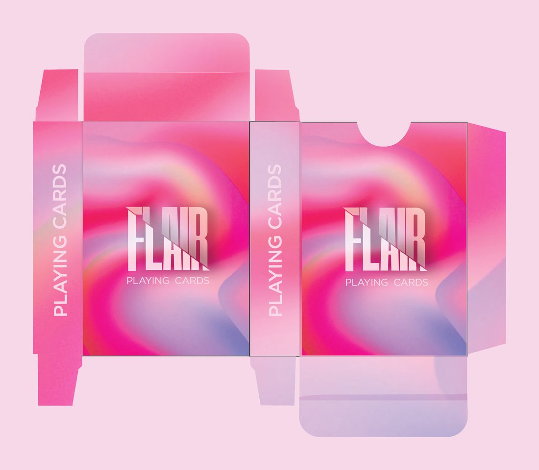
FLAIR is a playing card brand with music at its heart. The identity is built on a vivid gradient system, and the face cards carry hand illustrated portraits of music icons. I designed the brand, the packaging dieline and the full illustration set.

Date: 2024

Colour Palette ✦

The brief ✦

Reinvent the classic playing card deck as something premium and collectible, with the top 13 pop artists of all time illustrated across the face cards.

The challenge ✦

Younger audiences find traditional decks boring. FLAIR had to feel like art and music in your hands while still working as one deck, not 52 separate ideas.

My role ✦

The whole brand was mine: the name, the logo, the style guide, the packaging and every single card illustrated by hand.

Creative direction ✦

FLAIR means natural talent, a little wink at each artist's signature style. The logo's cuts and shadows bring the competitive thrill of a card game, all wrapped in a vivid gradient world.

The process ✦

I started by getting to know the audience, what they love, what bores them, and what other card brands were doing. Once the strategy was clear, the fun began: naming the brand, building moodboards, and designing and illustrating the deck itself.

FLAIR playing cards laid out around the deck box
Ten of spades illustrated card artwork Nine of spades illustrated card artwork FLAIR deck cover with gradient identity
FLAIR cards fanned out Nine of spades leaning on the FLAIR box FLAIR box and card deck FLAIR cards falling out of the pack FLAIR packaging dieline on a pink tile

Portfolio · UI UX

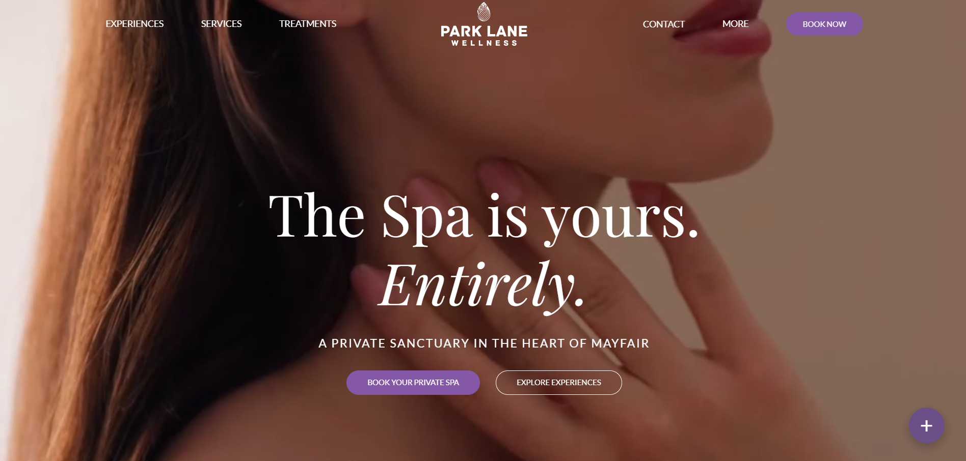
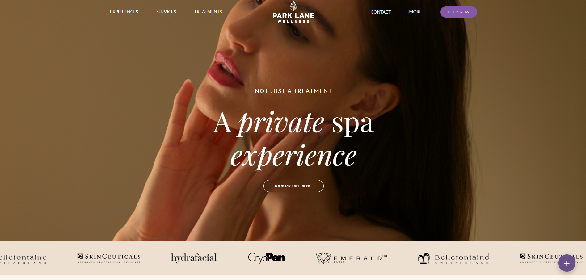
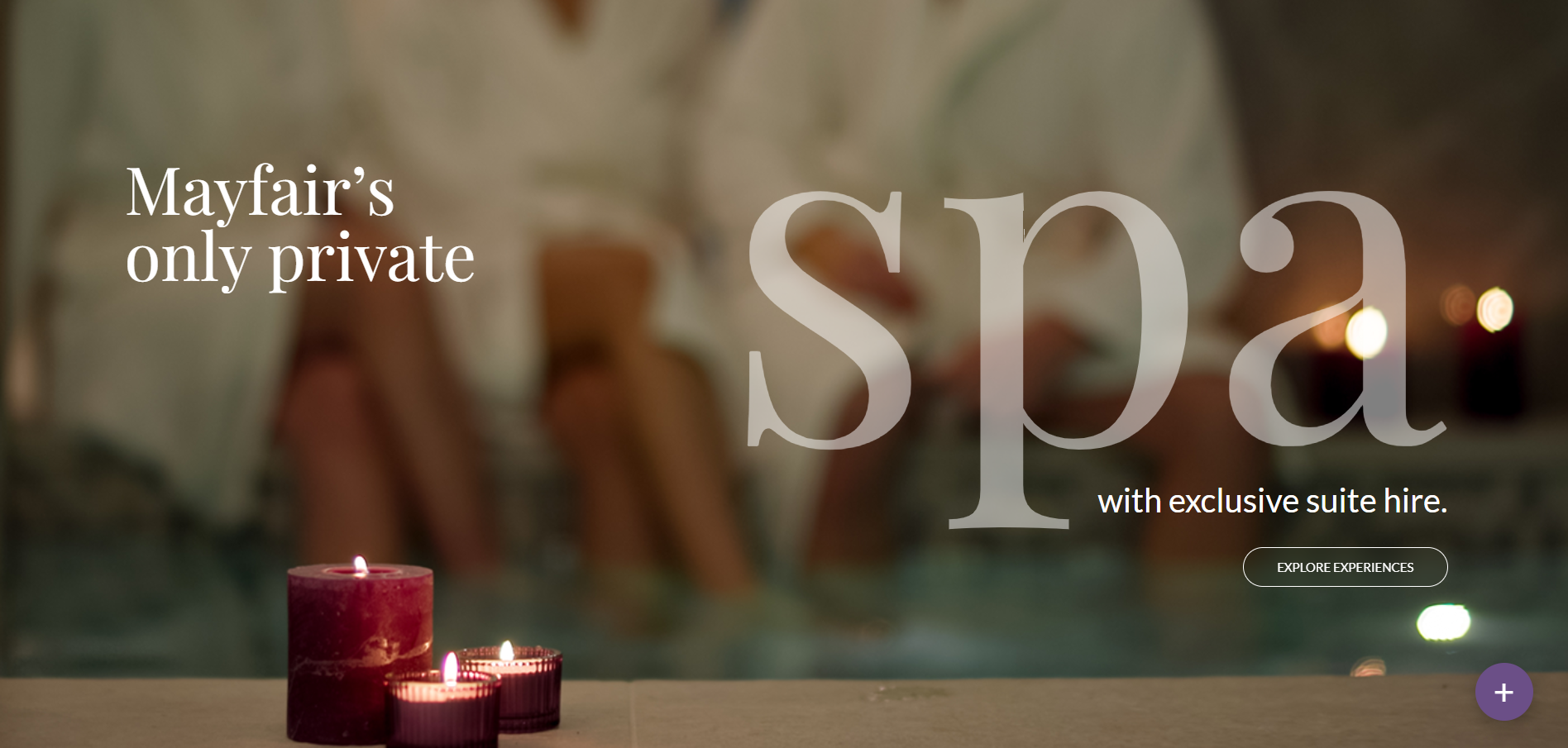
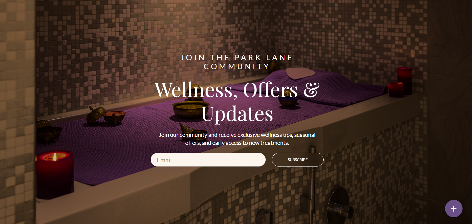
Parklane Wellness

Park Lane Wellness is a boutique spa in Mayfair, born out of a real passion for holistic wellbeing. Everything lives under one roof, from body and wellbeing treatments to spa rituals and facial aesthetics, and the whole philosophy rests on balance between body, mind and spirit.

Date: 2026

Visit live site ↗

The brief ✦

Design a website for Park Lane Wellness, a premium spa based in Mayfair. It needed to feel modern, clean, professional and above all premium, matching the calibre of the location and the clientele.

The challenge ✦

Luxury online is easy to overdo. The site had to feel expensive and effortless at the same time, guiding visitors to book without ever feeling busy or salesy.

My role ✦

I designed the full website experience, from layout and user flow to the final visual design and how it feels to move through the pages.

Creative direction ✦

Full bleed photography, generous space and elegant serif type set against a restrained palette, so every screen feels calm, confident and distinctly Mayfair.

The outcome ✦

A live website that positions Park Lane Wellness as the private sanctuary it is, turning browsing into bookings.

Park Lane Wellness website homepage, the spa is yours hero Park Lane Wellness website, Mayfair's only private spa section Park Lane Wellness website, join the community newsletter section Park Lane Wellness website, a private spa experience section

Portfolio · UI UX

Escape

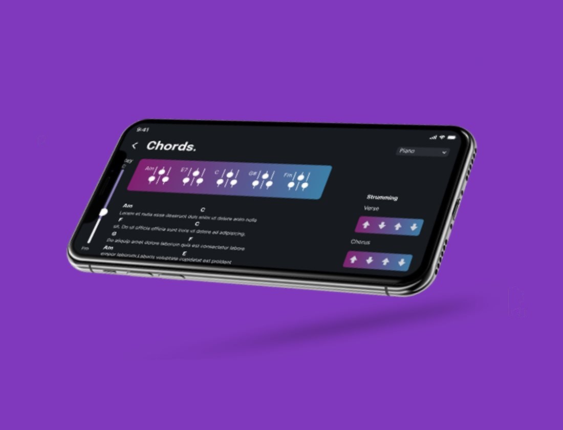
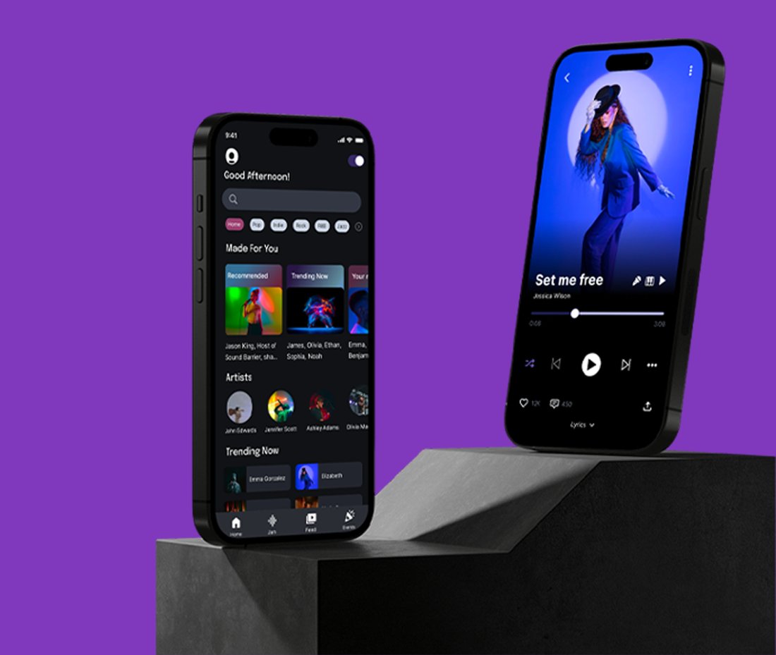
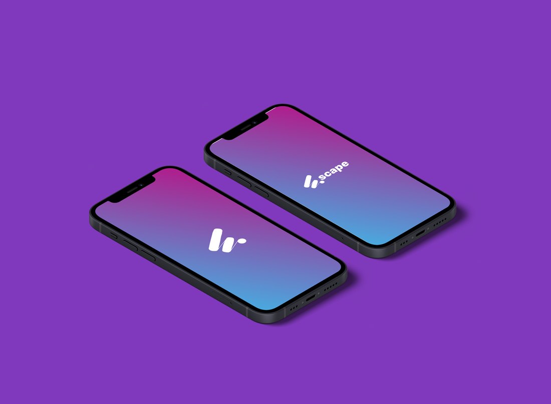
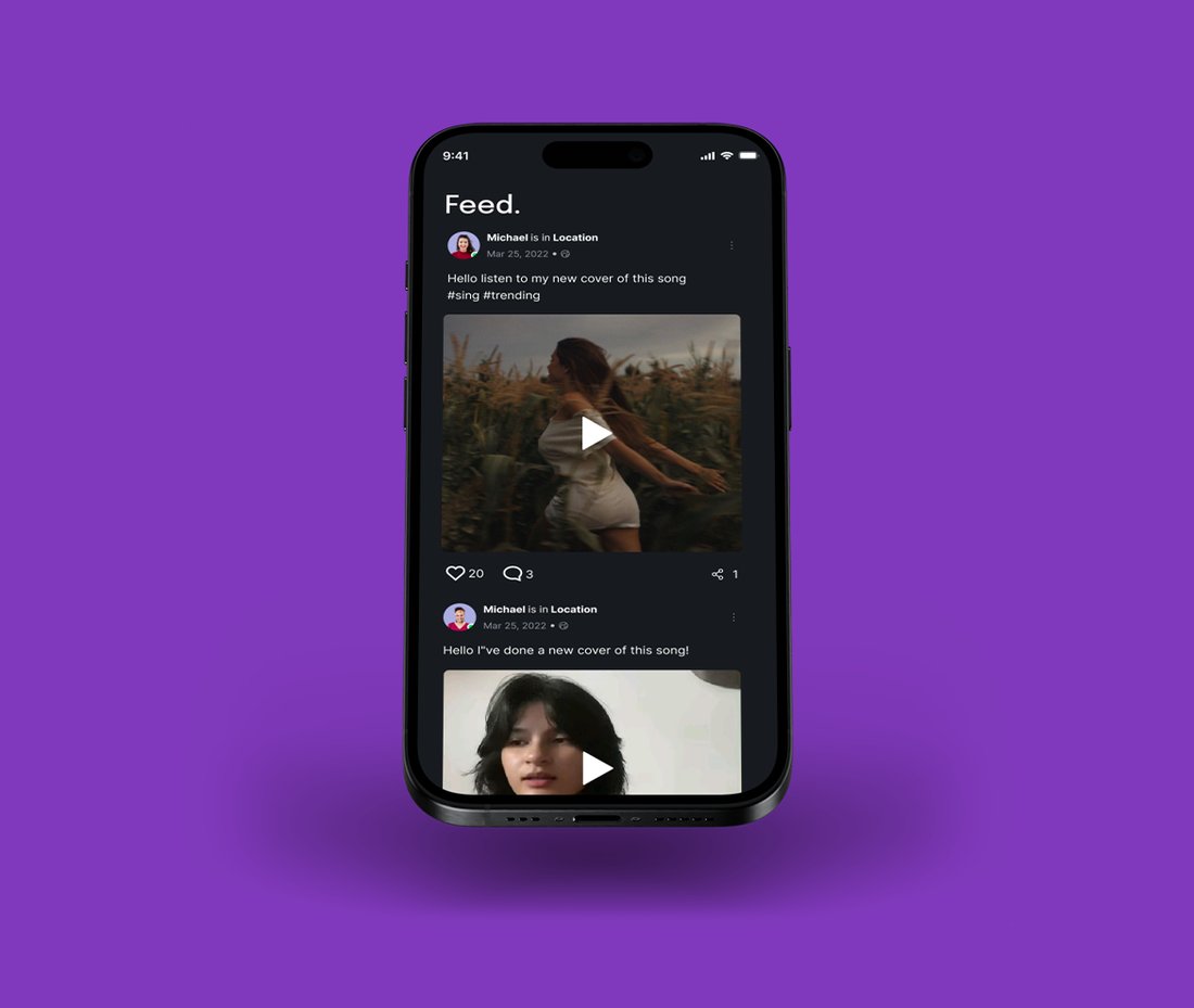
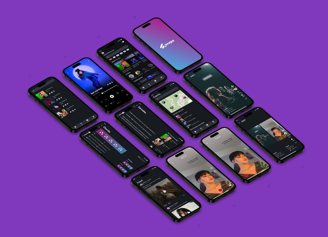
Escape is a music app concept for musicians and music lovers, designed to make discovery and collaboration feel effortless. I designed the brand and the full app experience, from user flows to final screens, with an immersive dark interface and a bold gradient identity.

Date: 2024

Colour Palette ✦

The brief ✦

Design the UI and UX for Escape, a music app where musicians and their audience actually meet, and finding new music feels effortless.

The challenge ✦

Most music apps treat listeners and creators like separate species. Escape needed one experience where both feel at home, without getting cluttered.

My role ✦

I led the UI and UX during my internship at Roadelabs, from user flows to how every screen looks and feels to use.

The process ✦

The full design thinking journey: talking to users through surveys, building personas and empathy maps, mapping the app's structure, wireframing, moodboarding, then polishing the final screens with feedback along the way.

Creative direction ✦

A dark, immersive interface that keeps the music centre stage, with bold gradients that feel more like a gig than a library.

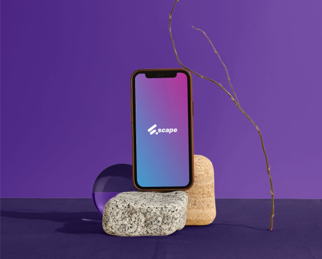
Escape logo over a concert crowd Escape chords screen on a phone Escape home and player screens on phones Escape splash screens on two phones Escape feed screen on a phone Full set of Escape app screens Escape splash screen on a phone resting on stones

Portfolio · Logo Identity

KOBLE

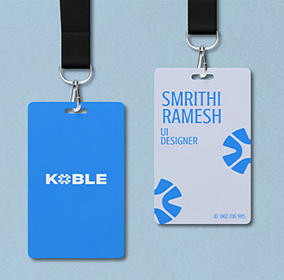
Koble is a platform that helps people reconnect with peers from their academic past. The O in the wordmark is built from figures coming together from different directions, a small symbol of the app's whole mission. I designed the logo, brand style and supporting collateral.

Date: 2024

Colour Palette ✦

The brief ✦

Design the brand identity for KOBLE, a platform for reconnecting with old peers and turning lost touch back into friendship.

The challenge ✦

Staying in touch is genuinely hard, and most platforms in this space look the same. The logo had to say reconnection at first glance.

My role ✦

Core logo design, brand elements, and rolling the identity out across every touchpoint.

Creative direction ✦

The name itself hints at connection, and the O is built from little figures coming together from different directions, so the app's whole mission lives right inside the logo. Vibrant blues and white keep it clean, modern and trustworthy.

Across channels ✦

From the mobile UI to ID badges, lanyards and print.

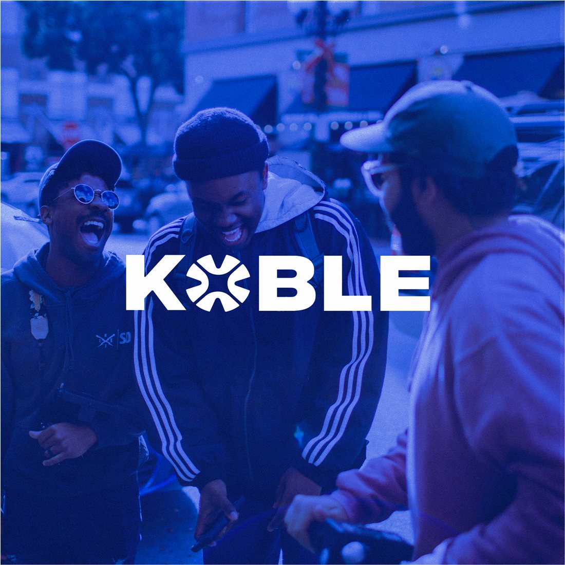
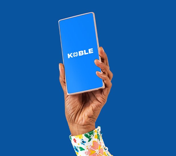
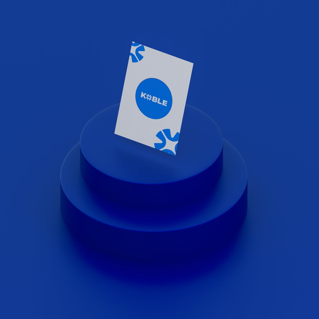
KOBLE logo over a photo of friends laughing KOBLE logo mark KOBLE app splash screen held up KOBLE branded lanyards and ID cards KOBLE card on a blue podium

Portfolio · Social Media

Park Lane Wellness

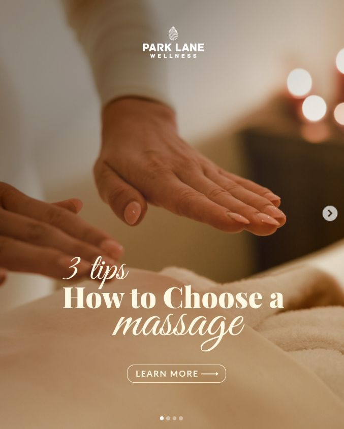
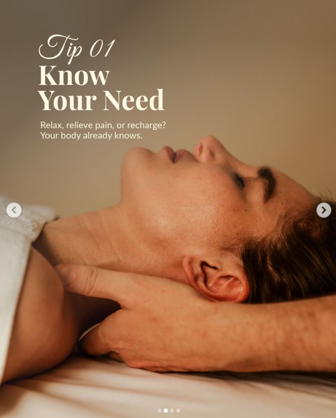
Ongoing social media creative for a wellness and massage studio. I design educational carousels and seasonal campaigns with a calm, editorial feel that matches the brand's sense of luxury and care.

Date: 2026 to present

The brief ✦

Ongoing social content for a wellness and massage studio, teaching and tempting in equal measure while protecting that premium sense of calm.

The challenge ✦

Wellness content online is usually either too clinical or too generic. These posts had to inform without breaking the spell that makes people book.
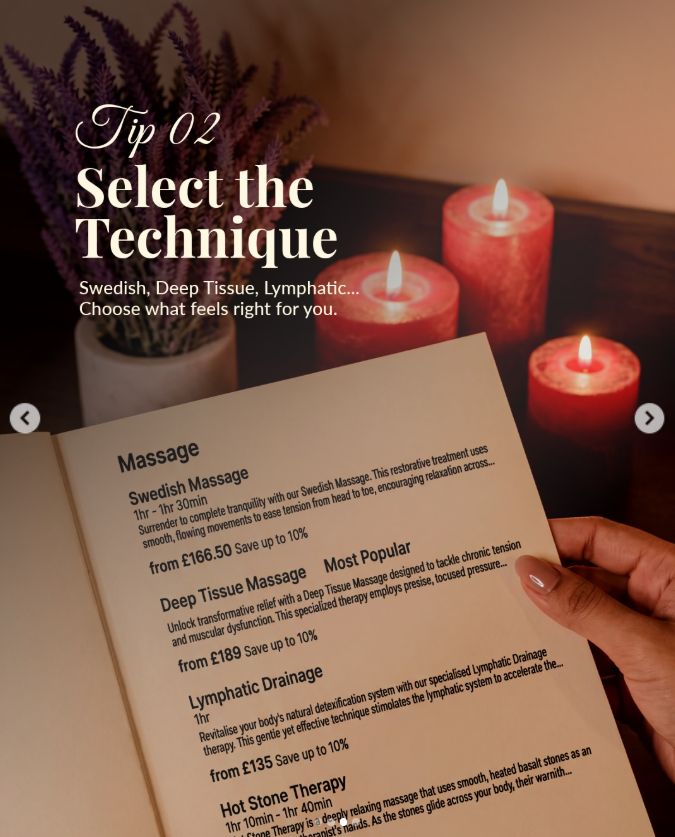
My role ✦

I create eye catching Instagram posts built to stop the scroll, using carousel formats that pull people in and make them swipe to see more, turning passive scrolling into interaction.
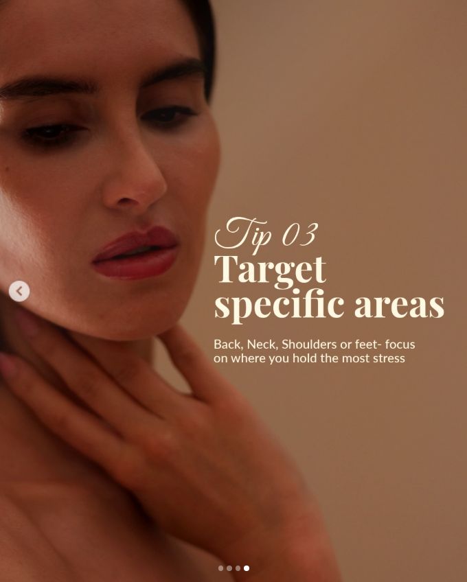
Creative direction ✦

Calm and editorial, with soft photography and restrained type, so even an educational carousel feels like part of the treatment rather than an advert.

Across channels ✦

Educational carousels, seasonal campaigns and story formats, all designed to sit beautifully together as a feed.

The results ✦

An ongoing retained relationship since 2026, with the carousels now a core part of how the studio shows up on Instagram month after month.

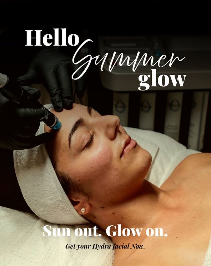
Park Lane Wellness carousel cover, how to choose a massage Park Lane Wellness tip one, know your need Park Lane Wellness tip two, select the technique Park Lane Wellness tip three, target specific areas Park Lane Wellness summer glow facial campaign

Portfolio · Social Media

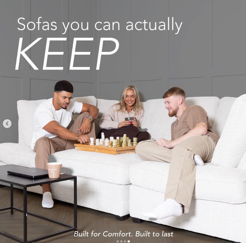
Sussex Sofas

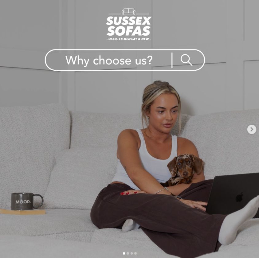
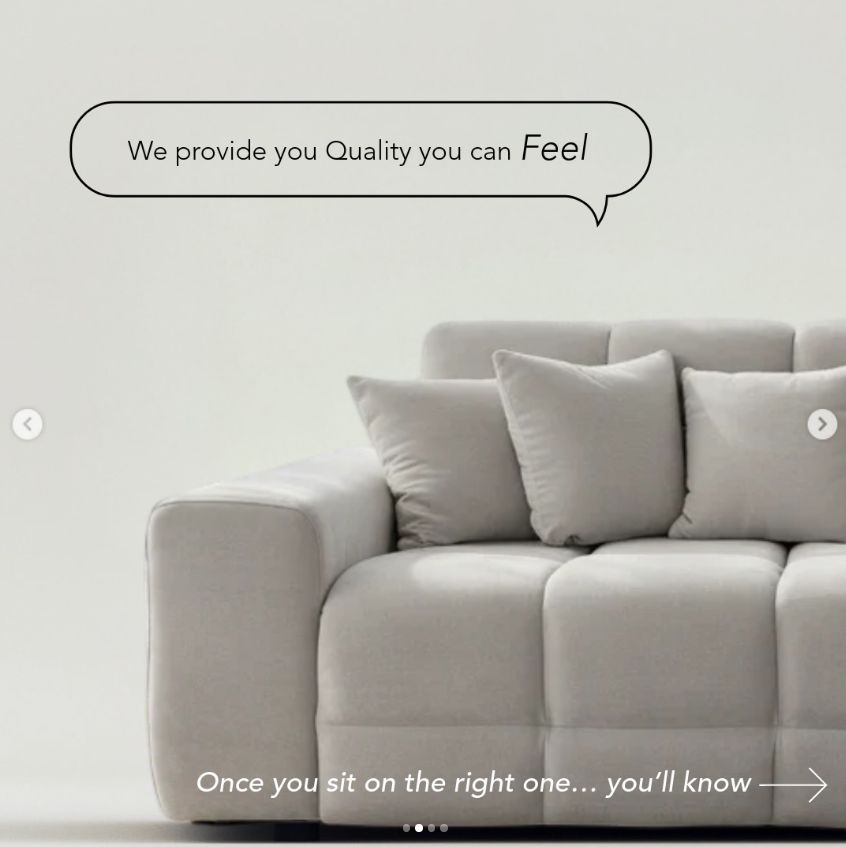
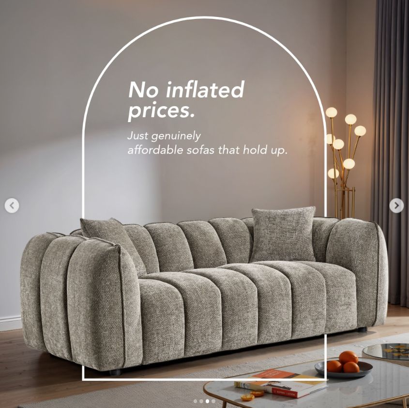
Social media creative for a sofa retailer selling used, ex display and new pieces. The carousels pair honest, playful copy with clean lifestyle photography to build trust and drive enquiries.

Date: 2026 to present

The brief ✦

Social creative for a sofa retailer selling used, ex display and new pieces, built to earn trust and bring in enquiries.

The challenge ✦

Used sofas and premium do not usually sit in the same sentence. The job was making them, while keeping things fun and honest so people trust the quality without feeling sold to.

My role ✦

I shape how the brand shows up on social, making it feel premium and fun at the same time through more creative, unexpected ways of depicting the sofas.

Creative direction ✦

Honest, playful copy paired with clean lifestyle photography, so the brand comes across upfront and likeable instead of salesy.

Across channels ✦

Carousels built for Meta and Instagram that work as single slides or as one satisfying swipe through.

The results ✦

An ongoing retained relationship since 2026, with the carousel approach now the backbone of the brand's social presence.

Sussex Sofas carousel cover, why choose us Sussex Sofas slide, sofas you can actually keep Sussex Sofas slide, no inflated prices Sussex Sofas slide, quality you can feel

Portfolio · Art

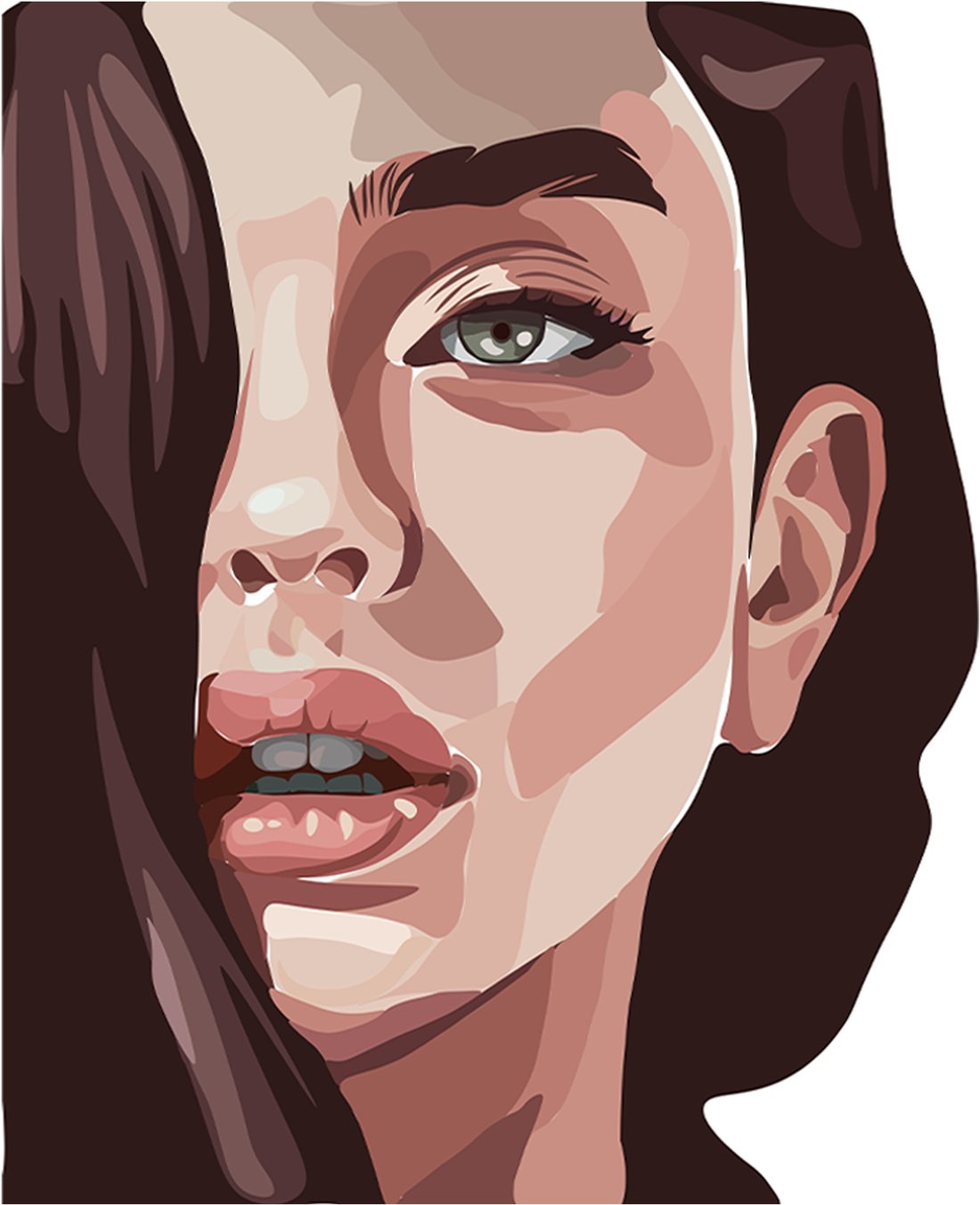
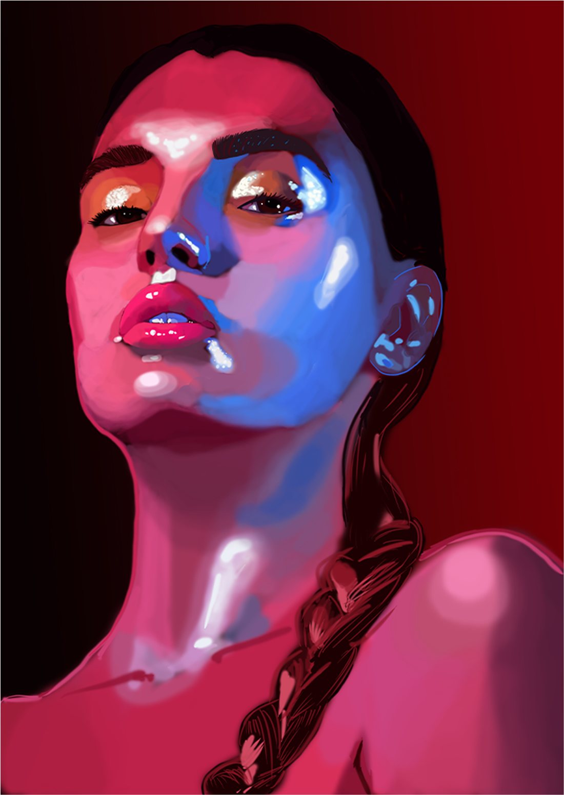
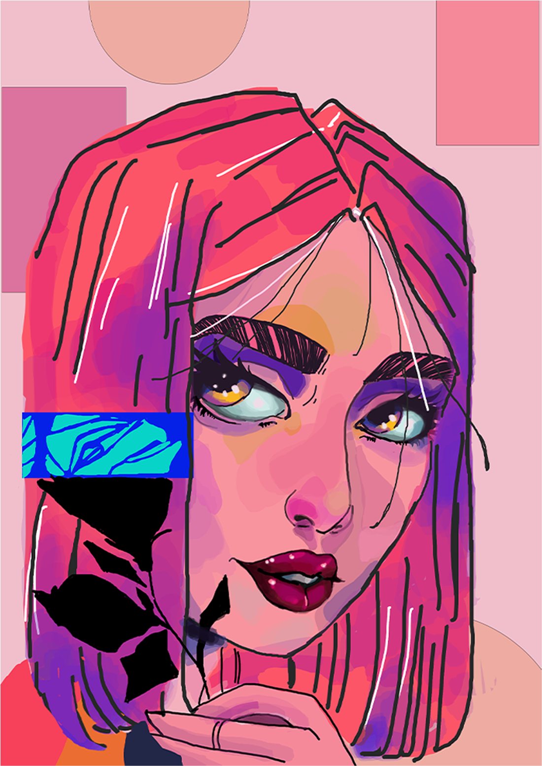
Digital Portraits

Away from client work I am always drawing. These digital portraits are part of an ongoing personal study of light, colour and character, carrying my traditional background in graphite and oil painting onto digital canvases.

Ongoing

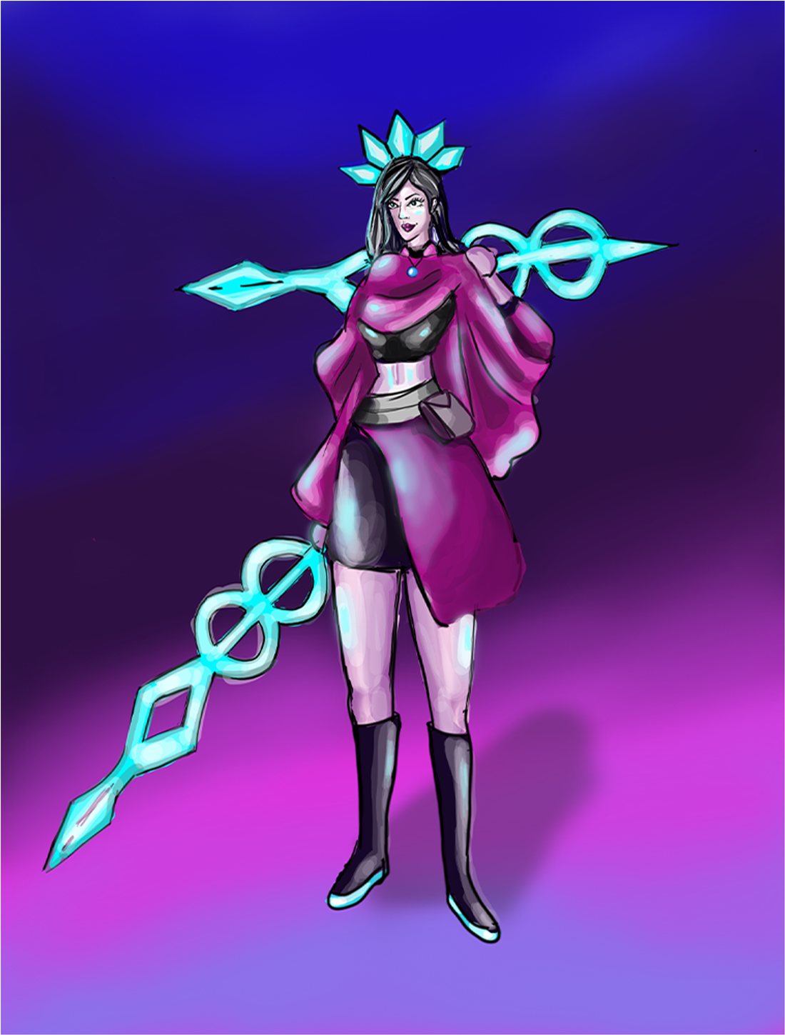
Digital portrait study of a face Digital portrait in red and blue light Stylised portrait with pink hair Character illustration with a glowing staff